Typography Portrait Case Study: Michelle Obama
Project Overview
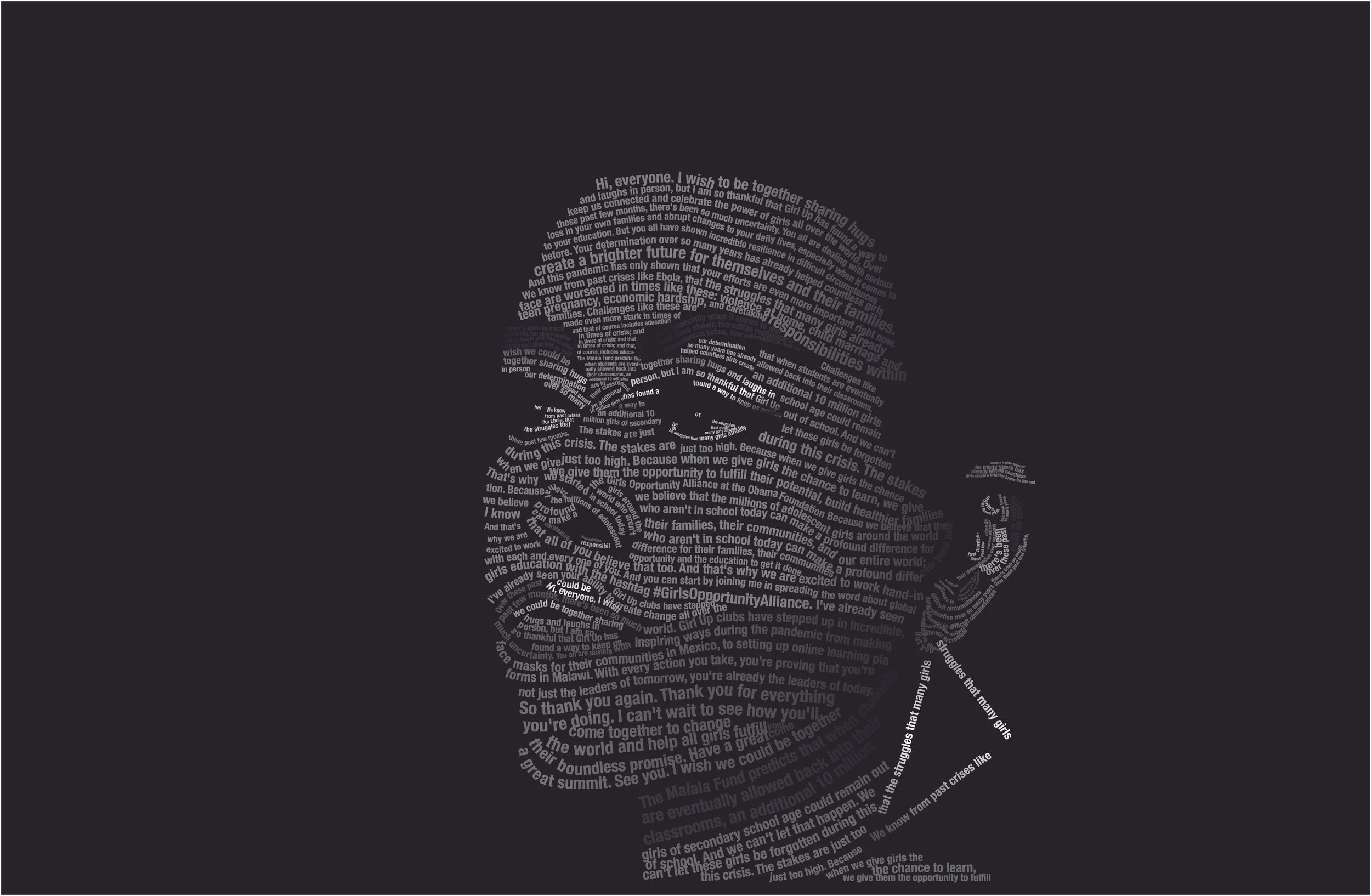
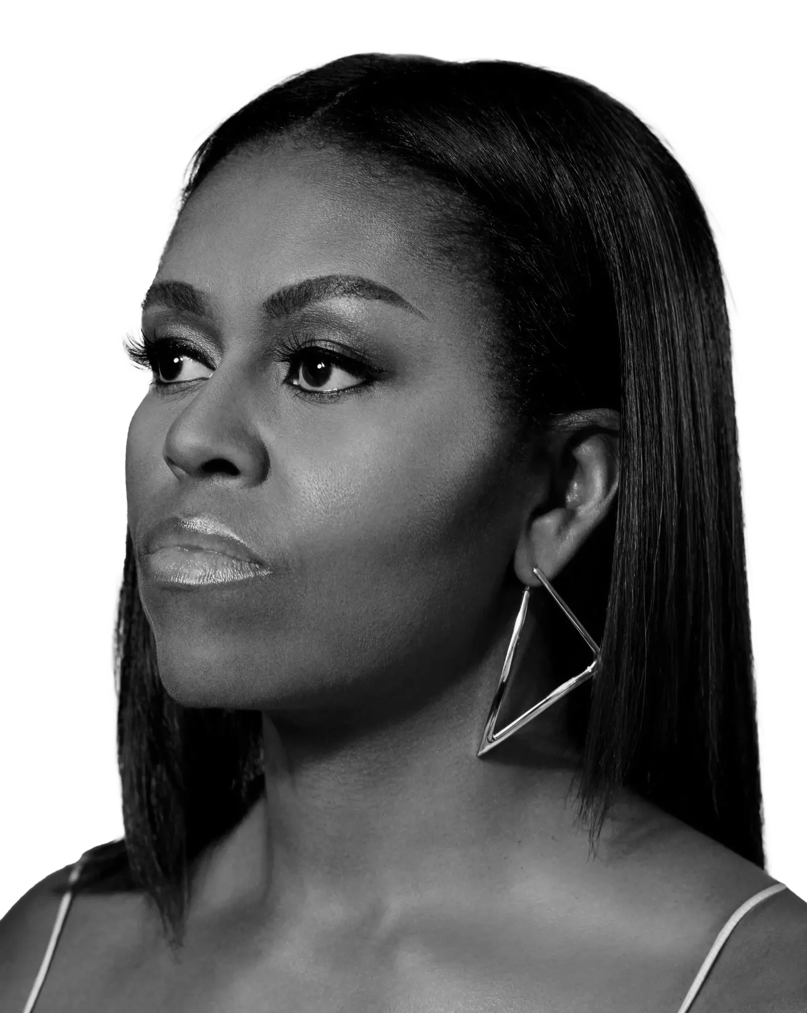
This project involved the creation of a typographic poster composed entirely of letters, words, and characters to construct the form, shading, and dimensionality of a well-known public figure. My chosen subject was Michelle Obama, represented through her speech “On the Importance of Educating Girls and Gender Equality.” The objective was to transform her spoken words into a visual form that embodies both her likeness and her message. The immediate audience included my professor and peers in a graduate-level course: Cross Media Design Solutions, within the Graphic Information Technology program. The final composition was later shared on social media platforms, where it received positive feedback from family, friends, and colleagues.
Problem Definition
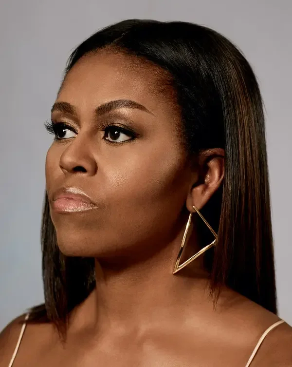
The primary challenge was to conceptualize and execute a typographic portrait that was both visually accurate and conceptually meaningful. The assignment required the selection of a prominent individual who had delivered a significant public speech, along with a high-quality reference image available online. The intent was to reinterpret this figure through typographic structure, demonstrating mastery of tonal variation, hierarchy, and form, using only text. I selected Michelle Obama for her strong advocacy of feminism and women’s rights, aligning the design’s visual strength with her message of empowerment and education. The goal was to produce a visually compelling black-and-white portrait that balanced aesthetic harmony with conceptual depth.
Research Highlights
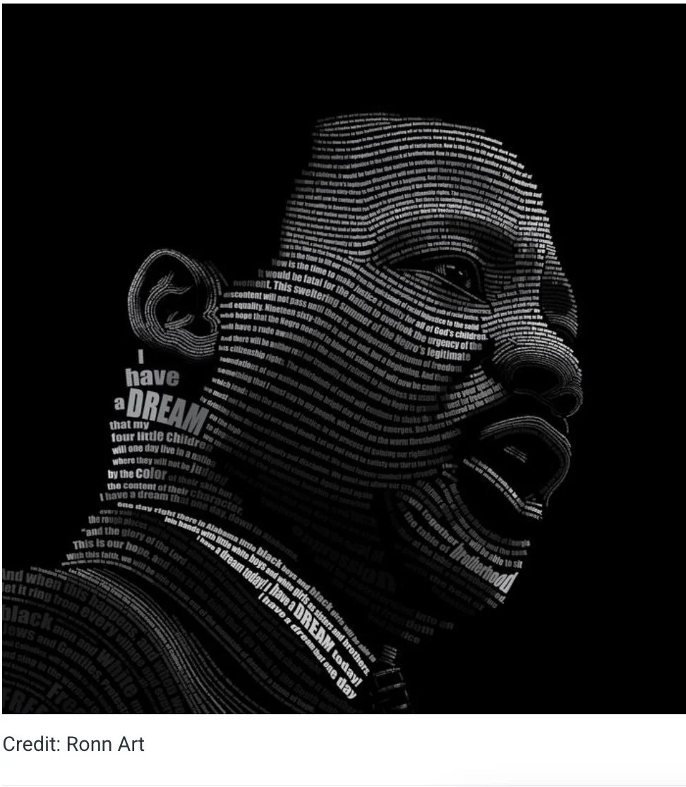
Preliminary research focused on understanding typographic portraiture techniques and the relationship between textual density and tonal variation. By analyzing similar works from contemporary designers, I identified effective methods for mapping typographic elements to corresponding tonal regions: highlights, midtones, and shadows in grayscale imagery. This research informed my approach to layering and composition, emphasizing contrast and legibility. In addition, a review of Michelle Obama’s speech provided contextual understanding and reinforced the importance of selecting words that embody her advocacy for education and gender equality. The process not only expanded my technical understanding of typographic form, but also deepened my appreciation for the intersection of visual design and social commentary.
Process Overview
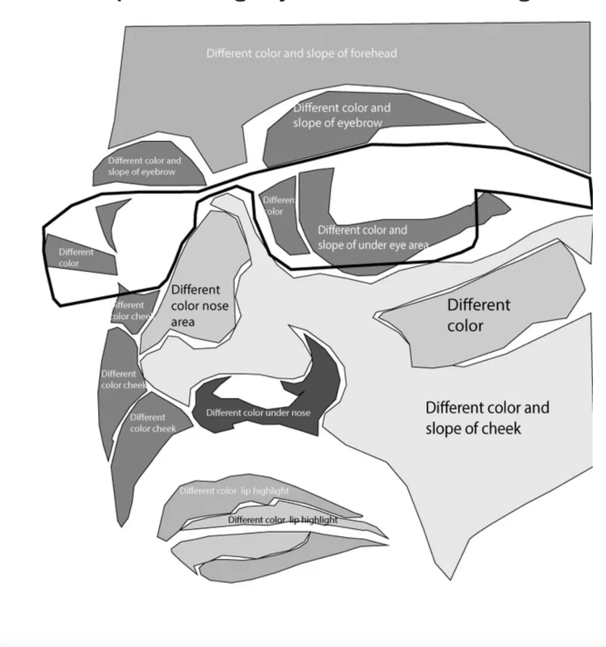
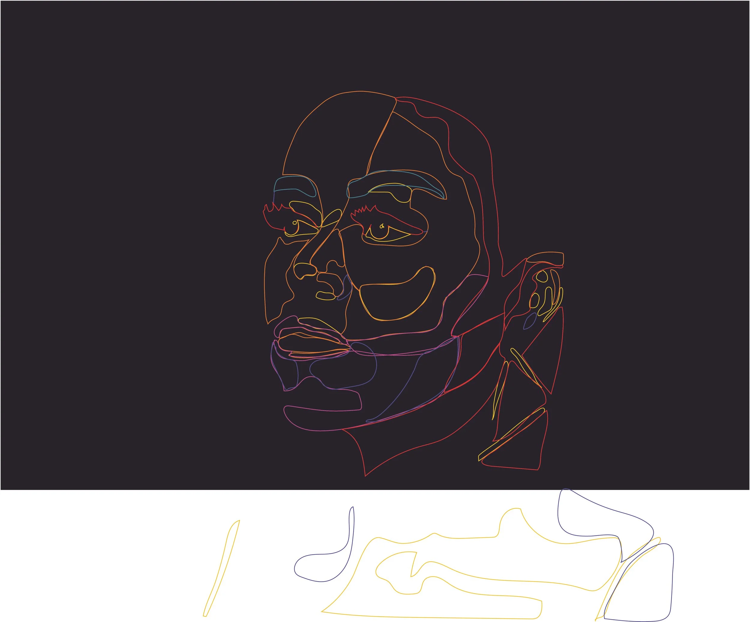
The design process began with a detailed tonal study of the reference photograph to identify key areas of light and shadow. The image was divided into tonal zones to guide the placement of text. Using Adobe Illustrator, I employed tools such as type, gradients, outlines, and clipping masks to construct layers of typographic texture that defined facial contours. The workflow progressed from highlights to shadows, gradually building depth and realism through variations in font weight, size, and spacing. Throughout this iterative process, I evaluated tonality, form, balance, and legibility to ensure the final composition maintained both aesthetic coherence and conceptual integrity.
Deliverables
• Enhance technical proficiency in Adobe Illustrator through the advanced application of typographic tools, gradients, form, and shading to construct visual depth using solely text-based elements.
• Develop an impactful typographic composition that integrates form and concept, transforming the words of Michelle Obama’s speech into a cohesive and expressive visual representation.
• Produce a refined, portfolio-quality artifact that demonstrates both aesthetic sensitivity and conceptual rigor, appropriate for academic evaluation and professional review.
• Effectively communicate a social message by visually interpreting themes of education and gender equality, aligning the design outcome with the subject’s advocacy and voice.
Results and Reflection
The final composition resulted in a visually striking black-and-white typographic portrait of Michelle Obama. Every letter and word from her speech contributed to the shaping of her image, creating a meaningful connection between content and form. The design effectively conveyed tonal variation and emotional resonance, earning positive evaluations from both my professor and classmates. When shared on social media, the piece continued to elicit favorable responses, validating its communicative and aesthetic success beyond the academic context.
This project provided an opportunity to explore typography not only as a communicative medium but as a form of visual expression. Constructing a portrait from type required precision, patience, and a deep understanding of tonal structure. More importantly, the project reinforced how design can be a vehicle for advocacy, using visual language to echo powerful voices and ideas. Through this experience, I gained both technical growth and a renewed appreciation for how design can inspire dialogue and reflection.